
Introduction:
In the vast star of fashion, printing and color contrast are like two bright stars, each blooming brilliant but complement each other. With endless creativity and agility, they give clothing unique vitality and visual impact. Then we as a POD clothing seller, how to grasp the balance between the two and design skills? This article will take you deeper into the art of print design, reveal the essence of the concept of color contrast, and how to combine the two to create a subversive fashion masterpiece. At the same time, we will analyze the various clothing styles one by one. — From dresses to sportswear, from professional wear to casual wear, explore its classic design elements, look forward to innovation, help you control the power of printing and color contrast, create a personalized fashion style.
Printing design: Artistic inspiration and craft expression
1. Theme selection and design
The first step of printing design is to select the theme, such as flowers, animals, geometry, abstract art, etc., according to the theme of the design and drawing, and strive to be vivid and full of stories.
2. Color matching and hierarchy construction
The use of color theory, carefully adjust the printing color, so that it not only conforms to the theme, but also forms a harmonious or contrasting relationship with the background color. The three-dimensional sense and level of printing are constructed through the change of color depth and light and dark.
3. Printing process selection
According to the design requirements and fabric characteristics, choose digital printing, screen printing, thermal transfer and other processes to ensure the clarity, texture and durability of the pattern.
4. Position layout and proportion control
Reasonably arrange the position of the printing on the clothing (such as the whole body, local, symmetrical, asymmetric), and control the size of the printing area to achieve visual balance and overall coordination.
5. Fabric adaptability considerations
Consider the match between the print pattern and the fabric texture (cotton, silk, hemp, synthetic fiber, etc.) to ensure that the print effect complements the fabric characteristics.
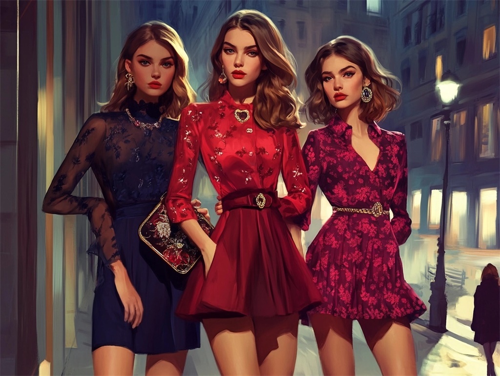
Color contrast concept: break the routine, release visual tension
1. Understand color relationships
Master the principles of color contrast, complementarity, similarity, etc., use strong contrasting colors to create visual impact, or create harmony and unity with subtle similar colors.
2. Partition color contrast policy
Color contrast design is used in different parts of the clothing (neckline, cuffs, pockets, splicing, etc.) to increase the detail and layer.
3. Use of lines and shapes
Use color contrast to strengthen the line outline or shape design of clothing, such as stripes, polka dots, plaid, splicing graphics, etc., to enhance visual appeal.
4. Accessories and color contrast echo
Through shoes, bags, jewelry and other accessories and clothing color contrast elements subtly echo, strengthen the unity of the overall shape and fashion sense.
5. Principle of moderation
Although the color contrast aims to break the routine, it is still necessary to follow the principle of moderation, avoid excessive color clutter leading to visual fatigue, and maintain the elegance and advanced sense of the overall style.
Blend of printing and contrasting colors: Innovative design practice
1. Printing as a color contrast carrier
Integrate the concept of color contrast into the printing design, such as using contrasting colors to draw printing patterns, or stitching printing elements of different colors on the same clothing.
2. Color contrast area highlights printing
The printing part becomes the visual focus through the color contrast block division, such as embellishing bright color contrast printing on a large monochromatic background.
3. Combination of fabric splicing and printing color contrast
The use of different colors, materials of fabric splicing, and with the corresponding printing design, to achieve the double artistic collision of printing and color contrast.
4. Transition color and gradient printing
Introduce transition color or design gradient printing at the junction of printing and color contrast, smooth transition visual effect and add artistic charm.
5. The overall design that echoes the theme
Ensure that prints, contrasting colors, and other design elements (e.g., cuts, fabrics, accessories) work together to create a cohesive fashion narrative.
Style interpretation: classic and innovative design of all kinds of clothing
Dress
Classic design: flower print, vintage polka dot, art graffiti; Innovation direction: 3D printing, science and technology photocopying flowers, environmentally friendly recycled fabric printing.
Blouse
Classic design: animal pattern, ethnic style geometric printing, simple letter slogan; Innovation direction: dynamic light and shadow printing, color-changing intelligent printing, interactive touch printing.
Business clothes
Classic design: fine geometric printing, low profile texture printing, brand logo embellishment; Innovation direction: Miniature landscape printing, art master joint series, environmental protection and sustainable concept printing.
Dress
Classic design: Flower and plant printing, classical oil painting reproduction, artistic line printing; Innovation direction: Digital art printing, futuristic science fiction theme, cross-cultural fusion printing.
Shirt
Classic design: stripes, plaid, small floral; Innovation direction: Liquid metal texture printing, minimalist line printing, removable modular printing design.
Pants
Classic design: camouflage, leopard print, art graffiti; Innovation direction: Photochromic printing, holographic projection printing, bio-inspired bionic printing.
Tights
Classic design: Abstract geometry, pop art, sports brand logo; Innovation direction: Thermochromic printing, human muscle texture printing, luminous printing.
Sportswear
Classic design: brand logo, sports pattern, science and technology lines; Innovation direction: dynamic sensing printing, environment responsive printing, AR augmented reality interactive printing.
Pajamas
Classic design: Flowers, animals, cartoon patterns; Innovation direction: Dreamy starry sky printing, artist cooperation limited edition, comfortable skin friendly printing.
Casual clothes
Classic design: vintage polka dots, cartoon images, travel-themed prints; Innovation direction: Personalized printing, environmentally friendly recycled material printing, science and technology sense of LED printing.
Conclusion:
Printing and color contrast design are like the color palette and brush of the fashion industry, giving clothing endless artistic charm and personality expression. Through the in-depth discussion of the artistic inspiration of print design, the essence of color contrast concept, and the innovative practice of combining the two, we not only enjoy the classic design elements in various clothing styles, but also gain insight into the possibility of future innovation. Whether you are a designer, consumer or fashion lover, you can draw inspiration from it and boldly try to describe your own fashion picture with the unique language of printing and color contrast on POD online clothing designer.
