
引言
在时尚界,色彩的选择和搭配不仅能够展现个人风格,还能影响整体的视觉效果。我们POD服装卖家无论是传统的Print-on-demand按需印刷,还是通过POD服装在线设计器,进行独特的服装设计,往往都需要具备一定的服装设计技巧,尤其是色彩和图案的搭配方案,是必备的“专业技能”,因为绝大多数的消费者,本身并不具备这一项能力,只能提出自己想要的需求,而无法真正的设计出想要的效果,如果我们能提供更加专业的意见,或者帮助她们设计出符合她们预期的成品,无疑会让消费者更加关注我们的店铺或网站,成为忠实的客户之一。那么,我们应该怎么做好色彩的搭配呢?不同的肤色,是不是也要考虑进去?答案是肯定的,本文将深入探讨肤色与服装色彩之间的关系,以及如何巧妙运用色彩理论来设计出既和谐又个性化的服饰。
色彩基础:理解色彩的本质
色彩是自然界中的一种奇妙现象,它通过光的不同波长反射进入我们的眼睛,进而被大脑解析为各种颜色。人们对于色彩的感知不仅仅是视觉上的体验,还包含了情感、文化等多方面的因素。了解色彩的基础知识,如色相、明度、纯度,是掌握配色技巧的前提。
主题:肤色与服装色彩搭配关系及应用
1. 什么是色彩?
- 色彩由色相、明度(亮度)和纯度(饱和度)三个要素组成。
- 不同组合可以创造出无数种色彩变化。
色彩一般可以分为无彩色和有彩色两类,我们经常说的黑白灰就是无彩色,按可见光的不同波长区分,有红黄蓝橙绿紫色等色感,这些称为有彩色。当然还可以按冷暖区分为冷色和暖色。
注意:色彩是可以影响人的心理的,我们的心理过程包括感知、记忆、联想、情感等心理过程和个性心理两部分,就如同你把房间全部装扮成无彩色,黑白灰等没有色彩倾向的颜色,会给人一种禁欲的情感倾向。也就是人们常说的性冷淡色,倘若房间都是一些明快,高饱和度的颜色如黄色,红色就会给人一种热情,“性”奋的联想。
2. 如何判断自己的肤色?
- 通过观察手腕内侧血管的颜色,大致分为冷色调(偏蓝紫色)和暖色调(偏绿色)。
- 也可以通过试戴金银首饰来辅助判断,如果金色更适合自己,则属于暖色调;反之则为冷色调。
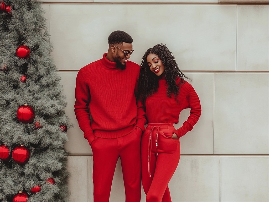
亚洲人肤色一般来说是介于黄色相和红色相之间的橙色区域,不同的肤色都是在橙色相区域中变化,所以会呈现出不同的视觉印象,有的偏黄,如棕色、象牙色、驼色等等,还有的偏红,如粉红色、玫瑰色、棕红色等。一般来说,亚洲人的肤色可以分为浅白、亮粉白、棕黄色这三种类型。
3. 亚洲人的三种肤色类型及其适合的颜色
- 浅白色型:这类皮肤比较白皙透明,适合柔和淡雅的颜色,比如粉红色、浅蓝色等。
- 亮粉白型:皮肤较白且带有自然红润感,适合明亮活泼但不过于鲜艳的颜色,例如桃红色、柠檬黄。
- 棕黄色型:具有健康阳光的感觉,适合温暖大地色系,如橙色、棕色或是深绿色。
亚洲人的三种肤色,差距其实并不特别大,但是已经足以出现不同色彩的不同效果了,而黑人和白人还有混血人种的肤色之间差距就更加大,对比也更加鲜明,所以我们POD服装卖家在做跨境电商的服装设计时,一定要关注自己的消费群体的人种和肤色情况,从而更好的为他们进行色彩方面的搭配方案,而这需要不断的试错,一般而言,我们可以利用AI工具来展现,以达到更好的效果,同时,也应该将这些内容记录下来,作为自己的“专业”积累,在后续遇到相同的情况时,可以做出更好更快的反映,同时,也有“案例”可以向客户推荐,从而获得更高的满意度。
4. 服装设计中的色彩对比
- 利用色彩对比可以让整体造型更加生动有趣,常见的有冷暖对比、明暗对比等。
- 适当运用对比色能够突出重点,增添活力,但需注意不要过度使用以免造成视觉疲劳。
在很多服装的设计中都用暖色来表现流行元素,而冷色使人放松,给人以宁静的感觉,并且冷色有后退的空间感觉,因此常用于背景色。另外,色彩冷暖的面积对比,也是服装设计和搭配中经常用到的,面积大小不同的色彩并列放置时,大面积容易形成整体色调,小面积色彩容易突出成为视觉焦点。将两个面积大小不同的色彩放一起,为了达到色彩平衡。一般用色彩强度弱的占大面积,色彩强度强的占小面积,这就是为什么在服装搭配中一般说用亮色来作为点缀色。
如很多街头品牌的配色都比较明亮显眼,对身材气质一般的人来说不容易驾驭,这就可以用到上面说的面积对比原则,在明亮的单品中加入饱和度底的缓冲色块,如配上百搭牛仔蓝,纯色T恤等等,会让穿搭这些明亮显眼的品牌,变得“温顺”许多,同样的,在服装设计上面,也可以采用相似的套路,使色彩的对比,更加柔和。
5. 服装色彩搭配技巧
- 单色配色:选择一种主色并在此基础上添加黑白灰作为点缀,简洁大方不易出错。
- 利用色彩三要素调整:在同一色相下改变明度或纯度,形成层次感。
- 主色+辅助色+点缀色:合理分配不同面积的比例,让整体看起来平衡协调。
除了遵循基本的色彩搭配原则外,在建议顾客加入一些体现个人特色的饰品或图案也能让她的装扮更加独特。同时,我们还要注意四季更替的外在因素,而随着四季更替,适时调整服装色彩建议,不仅符合天气变化的需求,也能给客户带来更加专业的印象,从而提升满意度。
结论
对于我们POD服装卖家来说,基础而正确的色彩搭配技巧不仅能让我们给消费者带来更好的体验,也能让我们的服务更加“专业”而优质,而这样的服务必然会给消费者带来更优的体验,在同质化越来越严重的当下,哪怕是POD服装行业,也开始陷入低价竞争的策略当中,而想要摆脱这个漩涡,就需要提升我们的竞争优势,其中,关于POD服装的设计,便是我们最需要掌控的能力之一,而根据肤色、季节、款式来调整色彩方案,也更显专业,是我们未来摆脱低价竞争的重要策略之一。
常见问题解答
1. Q: 怎样才能快速识别目标客群的肤色类型?
- A: 不同国家的肤色是有一个大的范围区间的,而深入的了解当地人的生活状态,以及细化目标客群的消费习惯,从而收集这一类消费群体的人种、肤色、生活习惯等内容,从而更加准确的判断出对方的肤色类型,比如在办公室工作的女性和经常外出工作的女性,是不同的,甚至哪怕是同一个人,肤色也会发生变化,因为日照,生活习惯,都会影响人的肤色,这需要我们更加细致的做出判断。
2. Q: 冷暖色调的区分标准是什么?
- A: 冷色调通常指带有蓝色调的颜色,而暖色调则偏向黄色调,暖色调通常包括红色、橙色、黄色等,象征着太阳、火焰、大地等,给人温暖、活泼、兴奋的感觉。这些颜色在心理上会产生膨胀、迫近的效果,常用于需要温暖和活力的场合。冷色调则包括蓝色、绿色、紫色等,象征着森林、大海、天空等,给人冷静、宁静、深远的感觉。这些颜色在心理上会产生收缩、开阔的效果,常用于需要冷静和安定的场合。
3. Q: 为什么说全身不超过三种颜色比较好?
- A: 这是为了避免过多的颜色造成视觉混乱,保持整体造型的简洁与统一,而太多杂乱无序的颜色,会让人的注意力分散,从而无法抓住其中的重点和刻画下深刻的印象,这会让人产生视觉和心理上的不适,理论上来说,服装的穿搭本质上是具有社交属性的,而杂乱无序的色彩,会使这一属性变坏,变差,所以不建议超过三种颜色汇聚在身上,以避免引起自身和他人的反感,但有一点值得注意的是,年轻人追求潮流,对色彩的包容性非常强,他们或许会特意用更多的色彩,来表现自己的个性,而这,是需要我们注意的。
4. Q: 对于肤色偏黄或者说棕黄色皮肤的人来说,哪些颜色是禁忌?
- A: 这类人肤色较暗,气色有力量,明度较低,如小麦色肤色,这类肤色相对适合以蓝色为基调的颜色,最佳深浅的颜色程度应该在深紫蓝色、淡绿松石蓝之间。紫丁香色,天空蓝,绿松石等色系。在全身搭配中用不同深浅的灰色,不同深浅的紫色以及浅粉色搭配效果最为和谐。另外,这类肤色不适合咖啡色系,会使脸泛黄。
5. Q: 如何根据场合挑选合适的服装色彩?
- A: 正式场合建议采用较为低调稳重的颜色,休闲聚会则可以根据个人喜好大胆尝试,一般来说,在正式的场合,黑白灰、深蓝等色彩是最基本的基调,而如果是休闲的聚会,则可以肆意的发挥出自身的优势,从而配合自己的肤色来装扮自己,表现出自己的特色以及当下的状态为佳。
